


Contrasting eye/lip
- Jan 14, 2016
- 4 min read
Editorial makeup for colour photography - contrasting eye/lip Focusing on colour theory principals. In this lesson we spoke about the colour wheel and contrasting colours. Opposites attract on the colour wheel - green eyes with warm purple tones. Blue eyes with orangey tones.
Primary colors: Red, yellow and blue. These colors make up all of the other colors on the spectrum.
Secondary colors: The colors you get from mixing the primary colors together : yellow + blue = green .... red + blue = violet ..... yellow + red = orange .
Tertiary colors: These are the colors on either side of the secondary colors. For example, red-violet or blue-violet, which you get by adding a little more of the closest primary color.
Hue: The true color of primary colors mixed together, as well as the secondary and tertiary colors mixed together. These colors are basic and intense. Once you have the basic colors, you can adjust them by adding white or black or gray, changing the brightness and density of the colors. This is how you get pastel and muted colors.
Tint: Made by adding white to a pure hue. So if you have an intense purple and add white, you’ll get lavender. If you have a bright orange-red and add white, you’ll get a warm orangey-coral.
Shade: Made by adding black to a pure hue. If you have a bright red, and add a touch of black to it, you’ll get a deeper, richer red.
After discussing this slightly, Holly started the Demo. She used a concealer as a base on the eye. Be it concealer or paint pot, this step is good if you are using bright colours, this will help it Pop. Using a purple eye liner pencil she lined a cut crease. She spoke to us about being able to use any colours we like for this look. She then used a white pencil to colour in the lid under neath the purple. This step helps the yellow pop and stand out, it also cleans up the under edge of the purple. She then took the yellow eyeshadow and patted it on top. Taking a small blending brush, she used a matte purple eye shadow and took it on top Of the liner, this helped it all blend out the contrasting colours, taking a lighter purple higher up to really blend this out. Then taking a yellow pigment she placed it on top of the yellow eyeshadow, this helped the colour stand out and also further define the line. Below is her finished look -
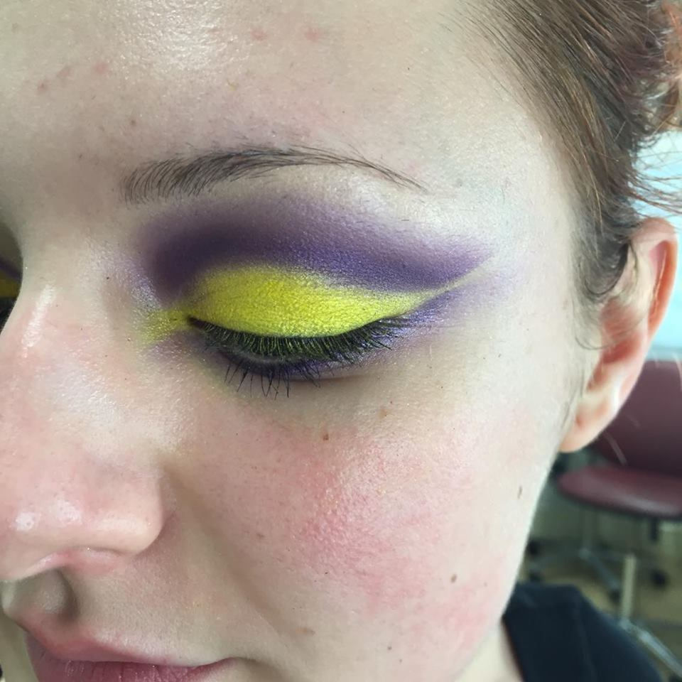
I was then paired up with Jo who Holly had worked on. Therefore once we both had to do eachother's makeup, I chose to keep the same colours, purple and yellow and I did the left eye, leaving Holly's work on the right eye and I finished off her whole face.
Below is a picture of the eyes. My work is on the left.


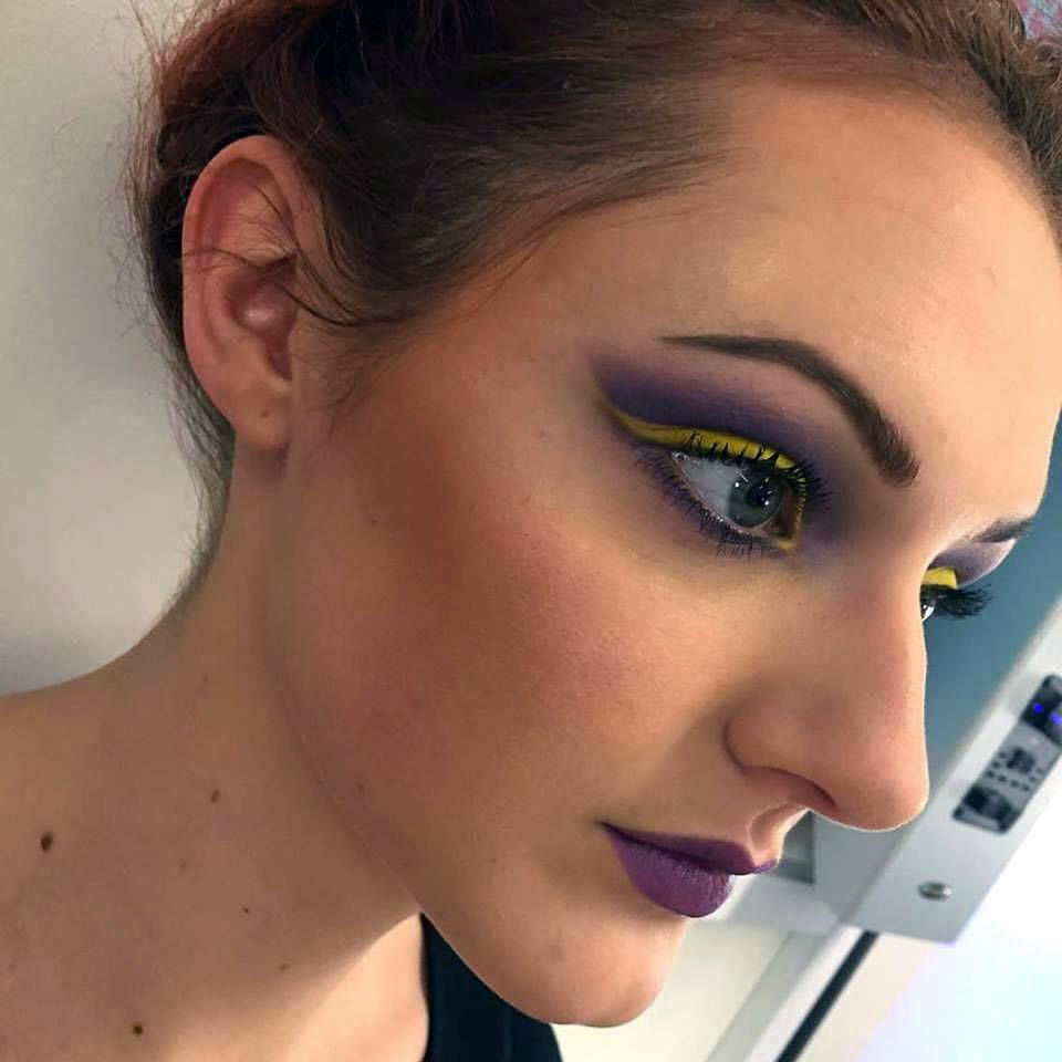
< That's the finished look with the foundation on, eyebrows done. and contour.
Products I used -
Eyes - Nyx 917 purple liner & White jumbo liner
Lime crime Aquataenia Palette (purple shade)
Mac purple eyeshadows in the shades ; Nocturnelle, Plum dressing and Chrome Yellow
Mac Haute & Naughty mascara.
Foundation - Loreal 24 hr Infallible shade 125
Concealer - Loreal instand rewind
Powder - Ben Nye ; Fair
Contour - Ben Nye ; Sienna
Eye brows - Mac liner ; Tapered
Lips - Mac Seductive Intent & Nyx 917 purple liner
I then tried out another look at home. Since purple also contasts with green I chose to use a light purple in contrast with my eyes. It's a slightly different consept but still works. It really made my eyes pop.

Products used;
Eyes - itsjudytime palette, Purple shades. Naked two palette, black
Loreal skinny tiner and Mac Haute and Naughty mascara
Estee lauder black liner
Brows - Anastasia Beverly Hills dip brow pomade in the shade Auburn and Mac eyebrow pencil in the shade strawberry blonde.
Foundation - Chanel perfection lumiere shade 30
Powder - Translucent powder by Sephora
Contour and highlight - Makeup Revolution ultra contour Palette
Lips - Mac stripdown lipliner and Mac Blankety lipstick
I then wanted to try another bold look using different colours. I chose to go with Blue and a burnt orange as it makes it more wearable. However, I then included blue brows just to make it more exciting. Below is the final result.

Products I used to create this look -
Eyes - iflash palette by makeup forever (blue shade), bh cosmetics blue shades & orange shades and mac eyeshadow in the shades Rule and Atlantic Blue
Loreal skinny tiner and Mac Haute and Naughty mascara
Estee lauder black liner
Brows - iflash palette by makeup forever (blue shade)
Foundation - Chanel perfection lumiere shade 30
Powder - Translucent powder by Sephora
Contour and highlight - Makeup Revolution ultra contour Palette
Lips - Sephore lip liner in the shade Brown is back.
Overall I love all the looks I created. The purple and yellow is fun, funky and defined whilst the light purple and green is wearable and subtle yet the contrasting colours really look good together. The blue and orange look I created is definitely my fabourite. The colours really pop and I managed to achieve a nice straight look which stands out. Also the last two photos I took with my professional Cannon 500D camera which really makes a difference and shows my work to its best quality. I will be definitely taking it into my lessons more often to document my work with great quality.
I loved doing this and I feel like i've learnt alot with contrasting colours. It also made more sense to me regarding skin and how green would cancel out the redness ect.
Sources accessed on 14/01/16
http://sharonthemakeupartist.com/colour-theory-in-makeup/
Comments